Success
If you are hunting for the best customizable EPUB reader for iPhone, you have probably already hit the wall every reader hits: each app gets one or two things right and forces a compromise on the rest. Custom fonts but no per-book settings. Nice colors but no custom fonts. Good spacing but only presets. This guide explains which customization features actually matter for reading comfort, then shows how the main iPhone readers handle fonts, themes, and margins so you can pick the one that fits how you read.
Customization is not decoration. Font, line spacing, margins, background color, and line width directly affect how fast you read, how much you remember, and how long you can read before your eyes tire. The right setup is not universal either: a dense reference book wants tight lines and generous margins, while a fast novel feels best wide and loose.
What the best customizable EPUB reader for iPhone should let you do
After years of reading on iOS, here is the standard worth holding any app to:
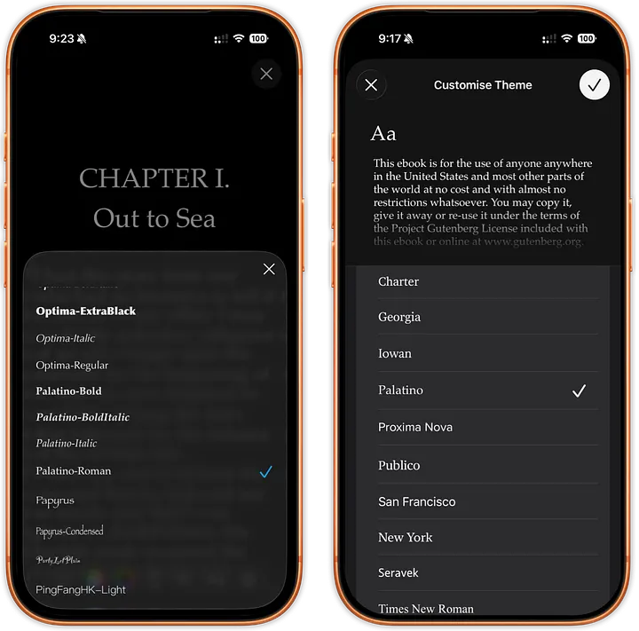
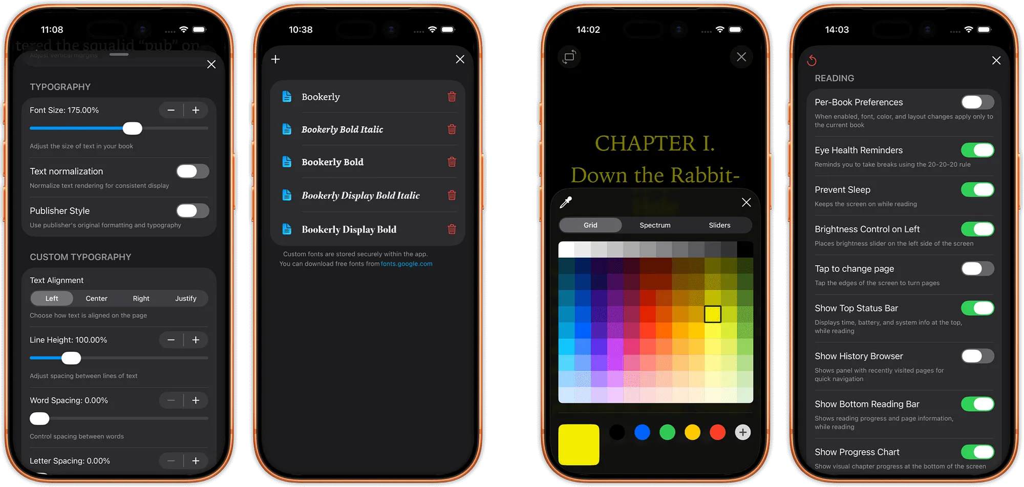
- Any font you want. Load your own .ttf or .otf files, not just a fixed list. Literata, Bookerly, Lexend, OpenDyslexic, whatever works for long sessions.
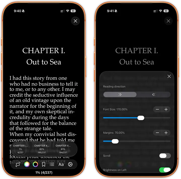
- Exact margins. Real numeric values you dial in, not "small / medium / large", and zero that means zero, all the way to the edge of the screen.
- Any color. A real color picker for text and background, so you can set that specific warm gray for night reading.
- Real line height and width control. Sliders or precise values, not three generic presets.
- Per-book settings. Your philosophy book, your novel, and your technical manual should each remember their own typography.
- Live preview. You should see changes on the actual page, not back out through menus to find out how it looks.
- Settings that are easy to reach. Power should not be buried four levels deep.
Most apps deliver a slice of this. Few deliver all of it together.
How popular iPhone readers handle customization
KyBook 3 was a power-user dream, with custom fonts, colors, margins, and line spacing, but it cannot save settings per book and has been abandoned for years. Marvin 3 told the same story: a great app with no active development. If you want a current option, our Marvin 3 alternative page covers what to move to and why.
Yomu looks beautiful and supports per-book settings and color schemes, but you cannot load your own fonts, margins will not go to true zero, and navigation feels strange. Apple Books gives you 14 fonts you cannot add to, 6 color schemes, and limited margin control hidden behind deep menus. Kindle on iPhone is even more locked down with fixed fonts, spacing, and themes (the hardware reader allows custom fonts; the iPhone app does not). BookFusion supports system fonts and custom colors, but the settings are buried, it clearly was not built for iOS, and large libraries can push it over the edge.
The recurring pattern: you never get everything you actually need, together, in one place.
Fonts: bring your own typeface
The single biggest gap in most iPhone readers is custom fonts. Built-in lists are fine until you need a specific typeface for comfort or accessibility, and then a fixed menu of 8 to 14 fonts is a dead end.
The better approach is to let you import font files directly. justRead gives you 200+ built-in fonts plus the ability to add your own .ttf and .otf files. That matters most for readers with dyslexia or visual sensitivity, where the right typeface is the difference between reading for ten minutes and reading for an hour.
Themes and color: past the preset trap
Color is personal. One reader's ideal page is another's eye strain, which is why a fixed set of four or six themes rarely fits everyone. Apple Books offers 6 schemes and Kindle 4, but neither lets you set a true custom color. BookFusion technically supports custom colors, but the change is buried so deep you cannot see the result without navigating back through several screens.
A real color picker for both text and background, with the change visible immediately on the page, is what separates a genuinely customizable reader from one with a few extra presets. Pair that with image inversion for night reading and you can tune the page to the room you are actually in.
Margins and spacing: reclaim the screen
Margins are where iPhone readers quietly waste your screen. Apple Books and Kindle both ship fixed, large margins with a narrow adjustment range. True margin control means setting exact values and being able to go to zero on every side, so you decide how much text fits and how often you turn the page.
Line height and line width deserve the same treatment: precise control instead of three presets. Combined with per-book memory, this is what lets a single app feel right across a whole varied library. For an overview of how all of this fits together, see the reading customization features and how justRead organizes a large EPUB library.
So, which customizable EPUB reader for iPhone wins?
If you only need a couple of fonts and presets, Apple Books is perfectly fine and already on your phone. But if "customizable" means your own fonts, exact margins, any color, real spacing control, and per-book layouts that the app actually remembers, the older power-user apps are abandoned and the polished ones are locked down. justRead was built specifically to close that gap on iOS, keeping deep control within two menu levels and staying smooth even with thousands of books.
Next, compare the full field in our roundup of the best EPUB reader apps for iPhone and iPad, learn how to read EPUB on iPhone and iPad, or browse all of our reading guides and comparisons.
← Back to Guides