Success
justRead.app
I tried every EPUB reader on iPhone and they all ignore the one thing that matters most.
Apple Books, Kindle, KyBook, Yomu, BookFusion… I’ve read with all of them. Each one gets some things right. But every single one forces you to compromise on how you read.
At some point, you stop comparing feature lists and see the real problem: you never get complete control over your reading experience.
The compromise of every EPUB reader
On paper, there are plenty of “advanced” EPUB readers for iPhone. In practice, they all ask you to give something up.
- KyBook 3 is a power‑user dream: custom fonts, colors, margins, and line spacing. But you can’t save settings per book, and the app has been abandoned for years.
- Marvin 3 had a similar story: great app, no active development.
- Yomu looks beautiful and supports per‑book settings and color schemes, but you can’t load your own fonts. Margins cannot go to true zero and the navigation through the app is somehow strange.
- Apple Books gives you a handful of fonts and color schemes, with limited margin control hidden behind deep menus.
- Kindle on iPhone is even more locked down: fixed fonts, fixed spacing, fixed themes. The hardware reader lets you install custom fonts; the iPhone app doesn’t.
- BookFusion supports system fonts and custom colors, but the settings are buried, and large libraries can push it to the edge. And you can immediately see it was not built with iOS in mind.
The pattern is always the same: Custom fonts but no per‑book settings.
Or nice colors but no custom fonts. Or good spacing but only presets.
Or per‑book settings but no future updates. Or this but not that.
You never get everything you actually need, together, in one place.
Why I think user control actually matters
Typography isn’t just decoration; it’s infrastructure for your brain.
Font, line spacing, margins, background color, and line width directly shape:
- How fast you can read
- How much you remember
- How long you can read before your eyes get tired
The “right” setup isn’t universal:
- A dense philosophy book works better with tighter lines and generous margins.
- A fast novel feels best with wider text and looser spacing.
- Technical and reference books often need their own layout to stay readable on a small screen.
Publishers of physical books have treated this as a serious craft for centuries. Typographers tune each book. On iPhone, you pick an app, accept its presets, and live with the compromise.
I wanted the opposite: an EPUB reader that gets out of the way and lets you tune everything to your eyes, your library, your habits. Per library as a default or per book, if you want to.
This is how I like to read, locked in landscape as much space as possible (damn that hole punch).
What complete control should look like
Here’s the standard I set for myself as a heavy EPUB reader on iPhone:
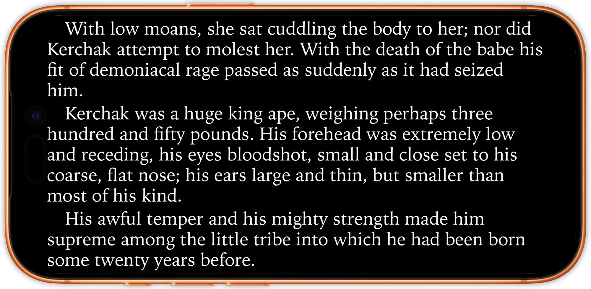
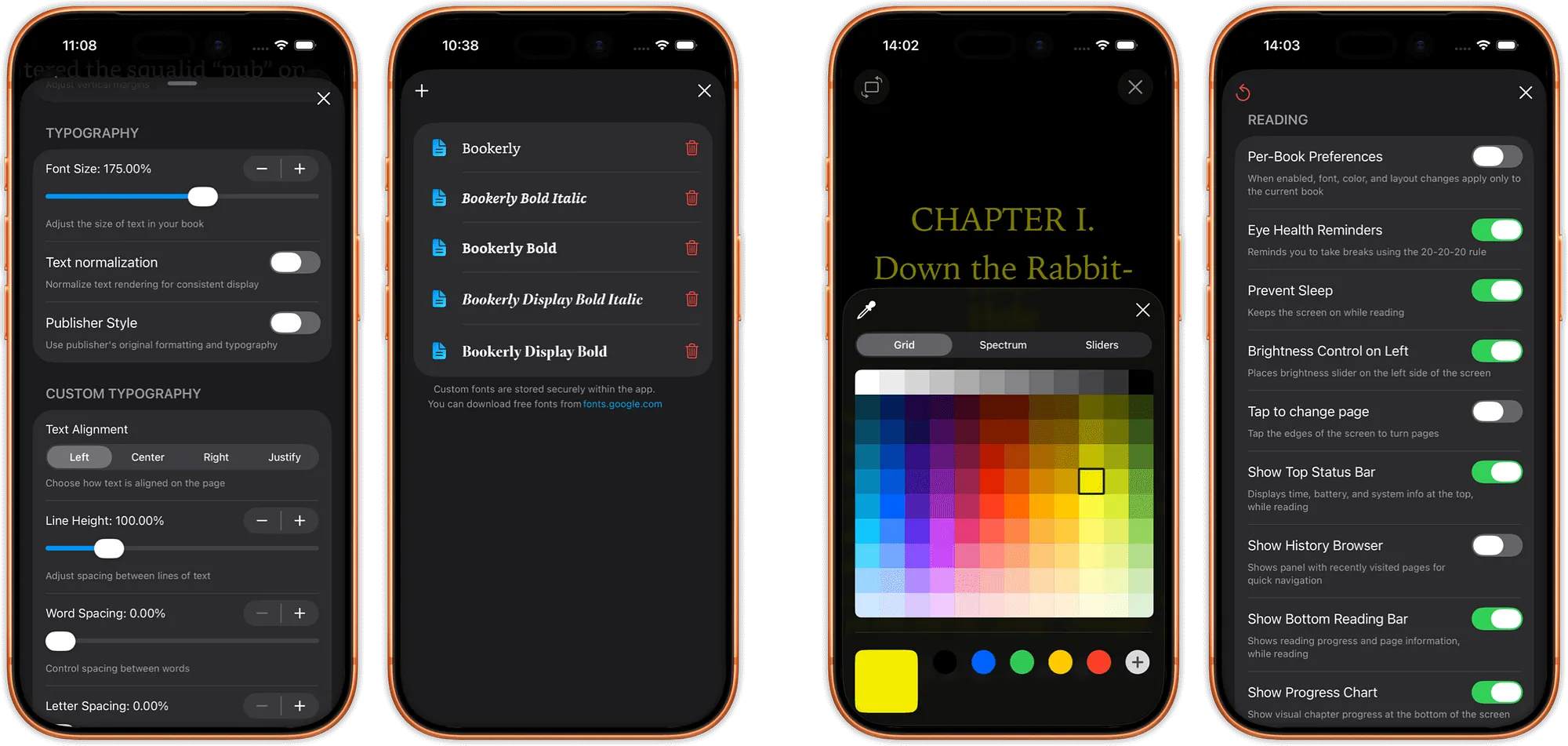
- Any font I want: load .ttf or .otf from yout own collection. Literata, Bookerly, Lexend, JetBrains Mono, whatever works for long sessions.
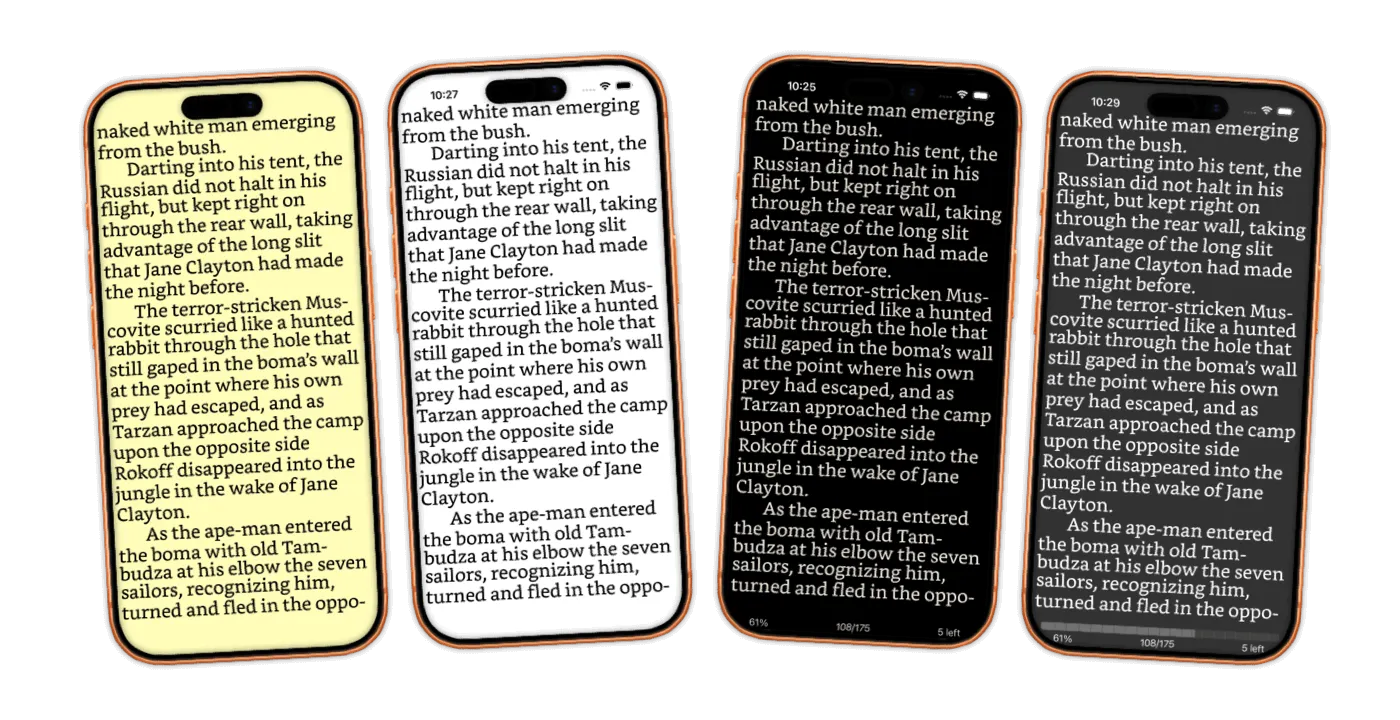
- Exact margins: Not “small/medium/large”. Real numeric values I can dial in until the page feels right. And zero is zero, to the edge of the screen.
- Any color: A real color picker for background and text. If I want a specific warm gray for night reading, I should be able to set it.
- Real line height and width control: Sliders or precise values, not three generic presets.
- Per‑book settings: My philosophy book, my novel, my cookbook, my technical manual, each should remember its own typography.
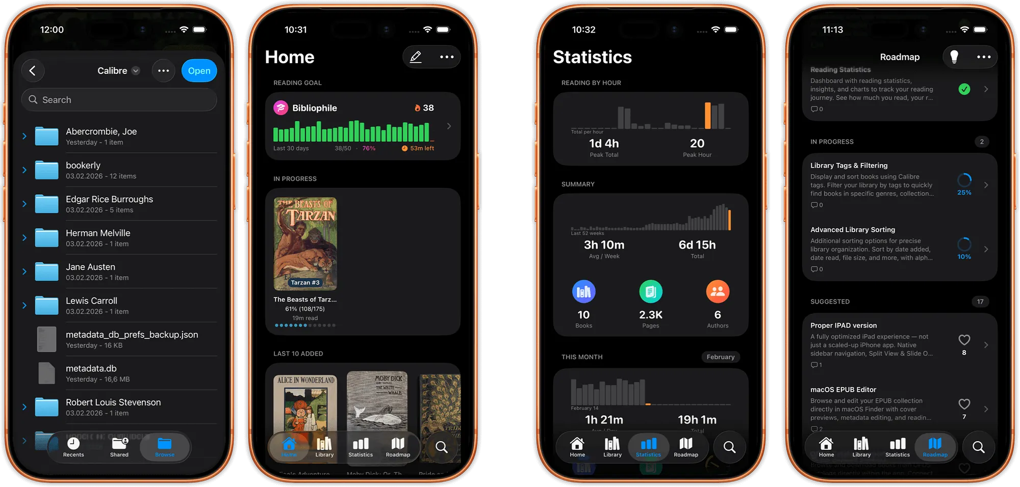
- A library that scales: I keep thousands of books. The app shouldn’t choke when I open or search my collection.
- Direct cloud reading: My EPUBs live in iCloud, Dropbox, or other cloud folders. I don’t want to import and duplicate everything into a new sandbox.
- Active development: If I build my reading life around an app, I want to know it’s not abandoned next year.
In short: complete control over how I read, without friction or fear the app will disappear.
No existing app gave me all of that. So I built one.
justRead.app give you the full control.
JustRead.app: the EPUB reader I couldn’t find
Six months ago, I started building the EPUB reader I wanted for myself. It’s called JustRead.app, and it’s launching in March 2026.
Here’s what it focuses on:
- Load any custom font from your files
- Set exact margin values instead of presets
- Pick any background and text color with a color picker
- Fine‑tune line height and line width
- Save per‑book settings so each book remembers its own typography
- Handle libraries with 5,000+ books (and stay smooth)
- Read directly from iCloud, Dropbox, and other cloud folders without importing
- Keep all important settings within two menu levels
I use it every day as my main reader. It’s built for the way I actually read, not for a feature checklist.
Right now it’s in TestFlight beta with over 150 testers helping to refine the details before launch. The roadmap is public, and you can vote inside the app on what should come next.
Select a library and just read.
Try it and see how it feels
www.justread.app launches on March 1, 2026. You can join the waitlist at the website below to get early access.
If you’re tired of choosing between “customizable but abandoned” and “polished but locked down,” this is for readers who refuse to compromise on how they read.
Peter
Reader, Developer, justRead Creator